Two-Tone Leather Golf Bags: The Design and Construction Playbook
Two-tone is the highest-drama colour architecture in golf bags — black-and-white tuxedo, navy-and-cream, tan-and-cream — and the most construction-exposed: contrast seams magnify every millimetre of cutting and sewing variance. The winning two-tone builds pair colours with historical logic, place contrast at structural panels, and are sewn by the most experienced teams on the line. This guide covers proven pairings, panel architecture, precision specs and OEM notes. Two-tone builds run across our leather colours hub.
QUANZHOU JUNYUAN BAGS, established 2014 in Quanzhou, Fujian, manufactures through an affiliated factory of 4,950 m², 7 production lines, 149 machines (126 sewing stations) and 137 staff — rated at 200,000 pieces per month, actual output around 150,000. Every order runs AQL 2.5 inspection, MOQ 200 (100-piece trial), sampling 6–10 days, bulk 35–50 days, with BSCI, ISO 9001:2015, CE, CPC and RoHS certifications (SGS audit, March 2026). We serve 200+ brands in 100+ countries.
Why Two-Tone Commands Attention
Single-colour bags are read as objects; two-tone bags are read as designs. The contrast architecture turns the bag’s structure — collar, panels, pockets, base — into its decoration, and it does so with a confidence that monochrome cannot match. In a shop or a photograph, the two-tone bag is the one the eye lands on first. That is not opinion but retail physics: contrast is how display works.
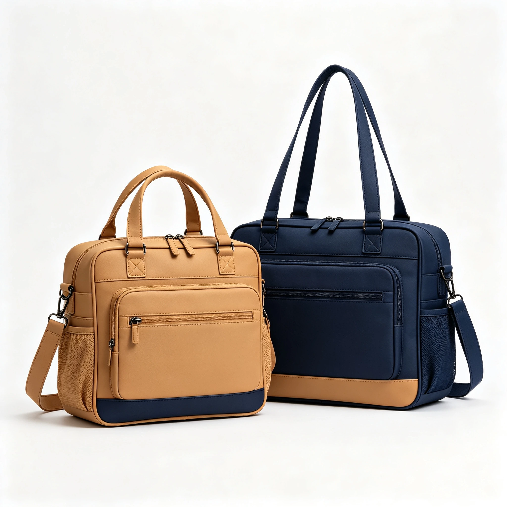
The heritage roots run deep: two-tone is the original luxury scheme of golf — the white-panelled staff bags of the television era, the tan-and-cream carries of the country-club decades. A two-tone bag references that archive instantly, which is why the architecture appears in every heritage range and why it never dates. Black-and-white reads as tuxedo; navy-and-cream as yacht club; tan-and-cream as saddle-and-linen.
The commercial behaviour matches the visual drama: two-tone builds over-index in gift channels, photography-led e-commerce, and limited editions — anywhere the bag must win attention before it wins comparison. For brands, two-tone is the fastest way to make a range look designed rather than assembled — provided the construction can cash the cheque the design writes.
The Proven Pairings
Two-tone success is pairing discipline: the combinations that work carry historical or material logic, and the failures are colours that merely contrast. The proven five: black and white — the tuxedo: maximum drama, tour-authentic, the eternal statement; white panels on black body is the classic orientation. Navy and cream — the yacht club: cool, clubbish, the pro-shop favourite. Tan and cream — saddle and linen: the heritage warm scheme, vintage-authentic.
Charcoal and tan — the contemporary scheme: modern without shouting, excellent with gunmetal hardware. Cognac and dark green — the British racing scheme: deep, rich, the connoisseur’s pairing, magnificent with brass. Beyond the five, provenance thins quickly: novelty pairings photograph once and date fast, while the classics have sold for sixty years.
| Pairing | Register | Hardware | Best channel |
|---|---|---|---|
| Black + white | Tuxedo formal | Gold / gunmetal | Statement, tour-tribute |
| Navy + cream | Club classic | Aged nickel | Pro shop, club programmes |
| Tan + cream | Heritage warm | Brass | Vintage, collector |
| Charcoal + tan | Contemporary | Gunmetal | Modern premium |
| Cognac + green | British racing | Brass | Connoisseur, limited |
The pairing rule that protects brands: choose from history, not from the colour wheel. Every proven pairing existed in the material world before it existed in a design file — saddlery, tailoring, motoring, yachting. That ancestry is what the customer’s eye recognises as "right" without knowing why. Invented pairings lack the ancestry, and the eye knows that too.
One pairing note that saves sampling rounds: approve both colours against each other, never separately. A navy that is perfect alone can die beside the wrong cream; a tan that sings with one cream goes muddy beside another. We ship pairing cards — the two leathers in contact, photographed in daylight and shop light — because two-tone approval is a relationship approval, and a relationship is not judged from individual portraits.
Panel Architecture: Where the Contrast Goes
Two-tone design is placement architecture, and the placements follow structure. The proven zones: the collar (contrast collar over tonal body — the crown of the design), the display panel (contrast branding panel — the tour-bag scheme and the highest-visibility placement), pocket faces (contrast pockets on tonal body — playful, vintage-friendly), the base (contrast base panel — grounding, practical in darker tones), and piping (contrast piping along structural seams — the detail that ties the architecture together).
The architectures that work are disciplined: two zones of contrast, maybe three — contrast collar plus display panel, or contrast pockets plus piping. The failures are enthusiasm: contrast on every zone turns design into patchwork, and patchwork reads as carnival rather than considered. The guiding ratio: the dominant colour should hold 60-70% of the visible surface; contrast is the accent, never the majority.
Orientation matters commercially as well as aesthetically. Light panels on dark body (white on black, cream on navy) read formal and photograph best; dark panels on light body read sporty and show less dirt at the contrast zones. Choose orientation by channel: photography-led and gift channels favour light-on-dark; play-heavy channels favour dark-on-light’s practicality.
Silhouette changes the architecture’s weighting. On staff bags, the big display panel is the two-tone stage — contrast panel with tonal body is the tour scheme. On stand bags, contrast collar plus pocket faces carry the design without disturbing the technical silhouette. On cart bags, the forward-facing pockets are the contrast opportunity because they are the face the cart presents. Sunday pencils take piping-only contrast: on a minimalist silhouette, a contrast welt is the whole design, and enough.
Construction: The Precision Tax
Here is the two-tone truth that pricing must respect: contrast seams are merciless. A millimetre of waviness at a black-white seam reads as a quality failure from across the shop; the same wobble in a tonal build is invisible. Every panel edge, every seam line, every piping run on a two-tone bag is on display — the design is literally drawn in the construction, and the construction must be drawn perfectly.
The production disciplines this demands: cutting tolerance held to ±0.5 mm on contrast-adjacent panels (versus ±1 mm on tonal), seam allowance consistency verified at every join, piping exposure uniformity checked continuously (piping is the two-tone signature and its exposure variance is the first thing the eye catches), and 100% seam-line inspection at gate two rather than sample-based checks.
Colour-fastness becomes a two-tone issue too: adjacent light and dark panels must not contaminate each other — dark dyes migrating into cream panels in rain is the two-tone horror story. The spec: both panels verified at ISO 105-X12 grade 4-5 wet rub, tested against each other, not just against standard cloth. Two-tone costs more to build correctly; the premium is buying exactly the precision the design exposes, and buyers should be suspicious of two-tone pricing that ignores it.
The cutting room is where two-tone economics are won or lost: contrast panels are cut to tighter nesting plans because the colourbreak lines are fixed at the pattern, not chosen at the saw. A tonal hide can be nested for maximum yield; a two-tone panel set must be nested for break-line position first and yield second, which costs 5-8% of the hide. Add the slower sewing cadence — contrast seams go to senior operators at reduced speed, with more frequent quality pauses — and the precision tax has a real, countable shape that honest pricing reflects.
Branding on Two-Tone Builds
Two-tone architecture changes branding physics: the contrast panel is the natural branding zone, and marks placed there achieve automatic focus. The proven executions: brand mark on the contrast display panel in the body colour (white mark on black panel, navy on cream) — maximum legibility with architectural integration; debossed or foil marks on contrast leather patches — the premium build; and piping-matched thread colours that let branding participate in the two-tone scheme rather than fight it.
The failure modes: branding that ignores the architecture (marks split across the colour break — never split a logo across a contrast seam), branding that competes with it (a third accent colour on a two-tone bag turns considered into chaotic), and branding that wastes it (tiny marks floating in huge contrast panels — two-tone panels are built for confident scale).
Limited editions live naturally on two-tone: a standard range silhouette with a special two-tone scheme is the cheapest, fastest limited edition in the playbook — no new tooling, new material lots only, and instant visual event. The edition playbook: permanent range in monochrome, seasonal drops in two-tone, and the contrast does the marketing. Branding specs are detailed in our branding guide.
Thread is two-tone’s quiet branding instrument. Topstitching in the contrast colour — cream thread on navy panels, navy on cream — ties the architecture together at detail scale and photographs as craftsmanship. The rule: thread answers the opposite panel, hardware answers the dominant colour, branding answers the display panel. When all three follow the architecture, the bag reads as one considered object; when any freelances, it reads as parts.
OEM: Two-Tone Programme Notes
A two-tone brief adds architecture fields to the standard spec: pairing (from the proven five or justified exception), orientation (light-on-dark or dark-on-light), contrast zones (collar / panel / pockets / base / piping — maximum three), colourbreak lines drawn on the pattern, and branding placement relative to the breaks. Colourbreak drawings are essential: "navy and cream" is not a spec; a pattern with marked break lines is.
Material discipline doubles: two colours means two material lots to lock, both verified to their masters, plus the cross-contamination test between them. Lead time is unaffected (materials run in parallel); the colour-approval stage simply doubles. MOQ 200 with 100-piece trials holds, sampling 6–10 days, bulk 35–50 days — with the construction premium discussed above reflected honestly in two-tone pricing.
Programme shape: two-tone as the range’s design statement — one two-tone architecture per silhouette, rotated seasonally, beside the monochrome volume shades. The two-tone carries the photography and the gift channel; the monochromes carry the play volume. This division of labour is how premium ranges have always worked, and two-tone is the hardest-working design investment in the colour playbook. Start at our quote page.
The merchandising payoff justifies the programme discipline: a two-tone hero in the range lifts the monochrome shades beside it — the halo works even for buyers who purchase the plain version. Retailers report two-tone displays stopping traffic at rates smooth ranges do not approach, and e-commerce pages led with two-tone imagery out-convert the same range led with monochrome. Design the two-tone as the range’s ambassador, not its oddity, and the whole line benefits.
The Bottom Line
Two-tone leather golf bags are design made visible: proven historical pairings (tuxedo, yacht club, saddle-and-linen, contemporary, British racing), contrast placed at structural zones in 30-40% of the surface, branding integrated with the architecture, and construction held to ±0.5 mm because contrast forgives nothing.
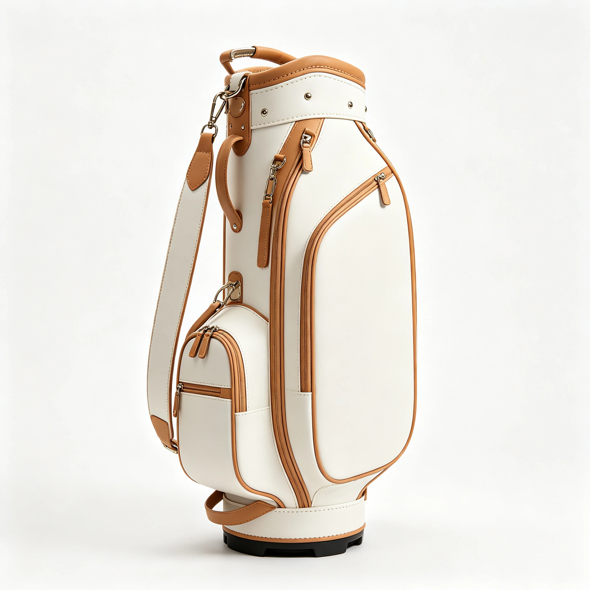
The architecture rewards the discipline: highest visual drama in the colour playbook, gift-channel over-performance, photography dominance, and the cheapest limited-edition engine available — new material lots, no new tooling, instant event.
Send the pairing and the silhouette, and two-tone samples — break-line drawn, precision-sewn, contamination-tested — come back in 6–10 days. Contrast is a promise of precision. Build the bags that keep it.
The commercial case, compressed: two-tone is the one colour architecture that simultaneously raises perceived value, lifts photography conversion, feeds the limited-edition engine and costs nothing in new tooling. Its only price is precision, and precision is purchasable — specified in the tech pack, verified at golden sample, inspected at every gate. Brands that treat two-tone as a construction programme rather than a colour option extract its full value; brands that treat it as paint discover the precision tax at the worst possible moment, in the customer’s hands.
And the design case is older than any of us: golf’s most photographed bags, from the television-era staff builds to this season’s tour trucks, have been two-tone. The architecture is not a trend to catch but a tradition to join. Join it with proven pairings, disciplined zones and honest construction, and the bag does what great design always does — it sells itself to the eye before the sales conversation begins.
Design Your Two-Tone
Send the pairing and silhouette. We return break-line-drawn samples in 6–10 days, quoted at MOQ 200 with a 100-piece trial.
Request a Quote →People Also Ask
What are the best two-tone combinations for leather golf bags?
The proven five: black and white (tuxedo — maximum drama, tour-authentic), navy and cream (yacht club — the pro-shop classic), tan and cream (saddle and linen — heritage warm), charcoal and tan (contemporary premium), and cognac with dark green (British racing — the connoisseur scheme). Choose from history, not the colour wheel: proven pairings carry material ancestry the eye reads as right.
Are two-tone golf bags more expensive to make?
Yes, honestly: contrast construction demands ±0.5mm cutting tolerance (versus ±1mm tonal), continuous piping-exposure control, 100% seam-line inspection, dual material lots, and cross-contamination colourfastness testing between adjacent panels. The premium buys exactly the precision the design exposes — be suspicious of two-tone pricing that ignores the precision tax.
Where should the contrast colour go on a two-tone bag?
Structural zones, maximum three: contrast collar (the crown), contrast display panel (the tour scheme, highest visibility), contrast pocket faces (vintage-friendly), contrast base (grounding, practical in dark tones), and contrast piping (ties the architecture together). The dominant colour holds 60-70% of visible surface; contrast is the accent, never the majority.
Light on dark or dark on light — which orientation is better?
Channel-dependent. Light panels on dark body (white on black, cream on navy): formal, photography-dominant — best for gift and e-commerce channels. Dark panels on light body: sportier, and the contrast zones show less dirt — best for play-heavy channels. Both are proven; choose by how and where the bag will actually be sold and used.
Can a logo be split across a two-tone colour break?
Never. A mark split across a contrast seam reads as a production accident, not a design. Branding belongs on the contrast display panel in the body colour (white mark on black panel, navy on cream), or on a debossed/foil contrast leather patch, placed clear of break lines. Branding should participate in the architecture, not fight it. Options in our branding guide.
Do two-tone bags show dirt more at the contrast zones?
Light panels show dirt faster wherever they sit — which argues for dark-on-light orientation in play-heavy use, and for placing light contrast high (collar, display panel) rather than low (base, pocket bottoms) in any orientation. White and cream panels should carry the same engineered finish as full white builds: pigmented top-coat, stain guard, ISO 105-X12 4-5.
Can dark dye bleed into light panels on a two-tone bag?
It is the two-tone horror story — dark dyes migrating into adjacent cream panels in rain — and it is prevented by spec: both panels verified at ISO 105-X12 grade 4-5 wet rub, tested against each other, not just standard cloth. Cheap two-tone fails exactly here. Cross-contamination testing is a line item in our two-tone golden-sample protocol.
What hardware suits two-tone leather bags?
Match the hardware to the dominant colour’s register: gold or gunmetal on tuxedo, aged nickel on navy-cream, brass on tan-cream and cognac-green, gunmetal on charcoal-tan. One finish across the whole build. Hardware should answer the dominant colour, not the contrast — it is the majority surface that sets the register.
What is the MOQ for a custom two-tone leather golf bag?
MOQ 200 pieces per design with a 100-piece trial, sampling 6–10 days, bulk 35–50 days under AQL 2.5 with 100% seam-line inspection. Brief includes break-line drawings, dual colour masters and contrast-zone specification. Start at our quote page.
Are two-tone bags good for limited editions?
The best limited-edition engine in the playbook: a proven silhouette in a special two-tone scheme needs no new tooling — new material lots only — and delivers instant visual event. The proven rhythm: permanent range in monochrome, seasonal drops in two-tone. Majors-themed and anniversary two-tone drops are consistent sell-outs in programme data.
How many colours should a golf bag design use?
Two, plus metal — the two-tone discipline. A third material colour turns considered into chaotic; the eye reads two colours as design and three as costume. Contrast stitching can add a whisper of a third tone at detail scale (cream topstitching on tan, gold on black) without breaking the rule, because thread is detail, not field.
Do two-tone designs date faster than solid colours?
Classic pairings date never — black-and-white and navy-cream have sold for sixty years. Novelty pairings date instantly. The two-tone designs that fail are not two-tone itself but invented combinations without material ancestry. Stay inside the proven five pairings and the architecture is as permanent as leather itself.
Can two-tone work on stand bags and pencil bags?
Yes, with silhouette-appropriate weighting: stand bags carry contrast collar plus pocket faces without disturbing the technical look; pencil and Sunday bags take piping-only contrast — on a minimalist silhouette, a contrast welt is the entire design, and enough. Staff bags give the biggest two-tone stage via the display panel. The architecture adapts; the discipline does not.
How are two-tone colours approved before production?
Against each other, never separately — two-tone approval is a relationship approval. We ship pairing cards with both leathers in contact, photographed in daylight and shop light, because a navy that is perfect alone can die beside the wrong cream. Both colours are then locked to masters, and the pair is cross-tested for dye migration (ISO 105-X12 wet rub, panel against panel) before cutting begins.
Does two-tone cost more in cutting yield as well as sewing?
Yes: contrast panels are nested for break-line position first and yield second, which costs 5-8% of the hide versus free nesting on tonal builds. Sewing cadence also slows — senior operators, reduced speed, more quality pauses. Together with ±0.5mm tolerances and 100% seam-line inspection, that is the real shape of the precision tax, and honest two-tone pricing reflects all of it.
Sources & Authority
Pairing and architecture analysis draws on heritage golf design archives and programme outcomes across 200+ OEM clients of QUANZHOU JUNYUAN BAGS. Construction tolerances and contamination-testing protocols from our AQL 2.5 QC framework, SGS-verified March 2026.